TUI est une société de voyage et tourisme multinationale dont le siège est à Hanovre, en Allemagne. C'est le plus grand groupe et leader de tourisme du monde et le premier voyagiste français. Il possède des agences de voyage, hôtels, navires de croisière, des magasins de détail et six compagnies aériennes.
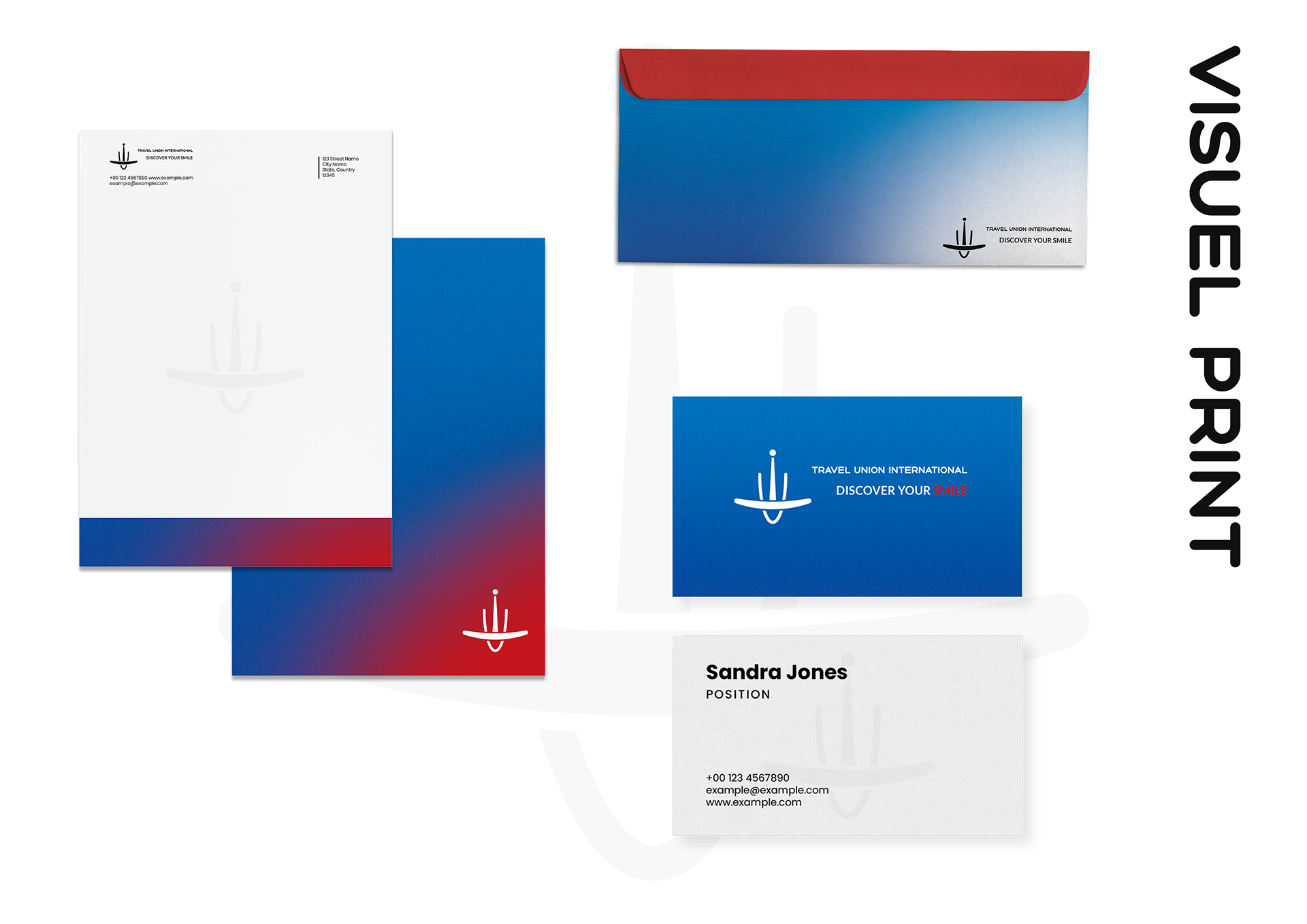
J'ai décidé de faire un refonte de l'identité graphique tout en respectant les valeurs de la marque c'est "Fiable", "Unique" et "Inspirant".
J'ai décidé de faire un refonte de l'identité graphique tout en respectant les valeurs de la marque c'est "Fiable", "Unique" et "Inspirant".
TUI is a multinational travel and tourism company headquartered in Hannover, Germany. It is the world's largest and leading tourism group and the leading French tour operator. It owns travel agencies, hotels, cruise ships, retail stores and six airlines.
I decided to redesign the graphic identity while respecting the values of the brand which are "Trusted", "Unique" and "Inspiring".
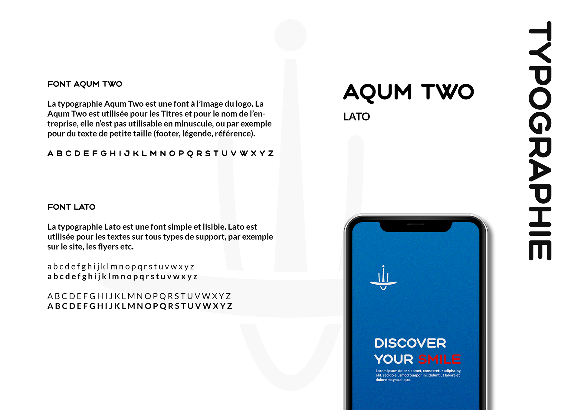
Typography
Aqum Two is a font with similar shape as the logo. Aqum Two is used for titles and for the name of the company, it is not usable in lower case, or for example for
small text (footer, caption, reference).
Aqum Two is a font with similar shape as the logo. Aqum Two is used for titles and for the name of the company, it is not usable in lower case, or for example for
small text (footer, caption, reference).
Lato is a simple and readable font. Lato is used for text on all types of media, for example on website, flyers etc.
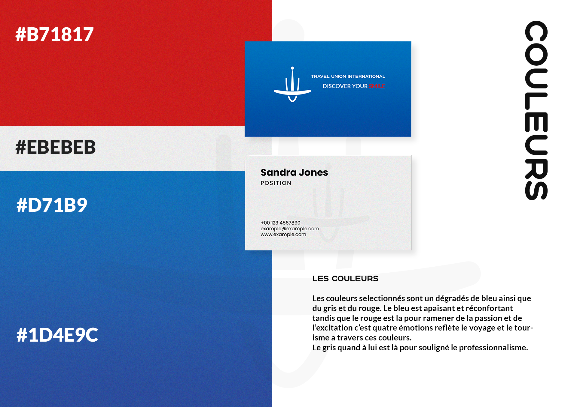
Colors
The colors selected are a gradient of blue as well as gray and red. The blue is soothing and comforting while the red is there to bring back passion and excitement. Four emotions that reflect travel and tourism through these colors. The gray is there to emphasize the professionalism.
The colors selected are a gradient of blue as well as gray and red. The blue is soothing and comforting while the red is there to bring back passion and excitement. Four emotions that reflect travel and tourism through these colors. The gray is there to emphasize the professionalism.
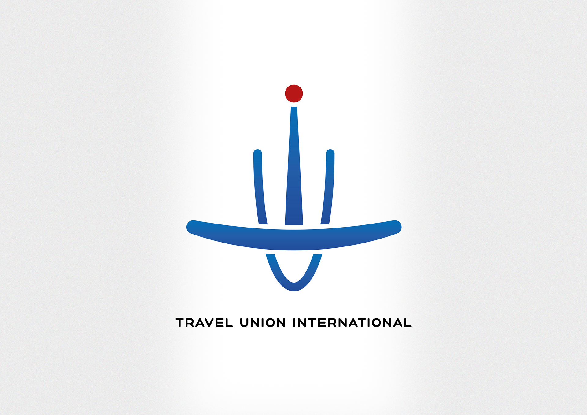
Logo
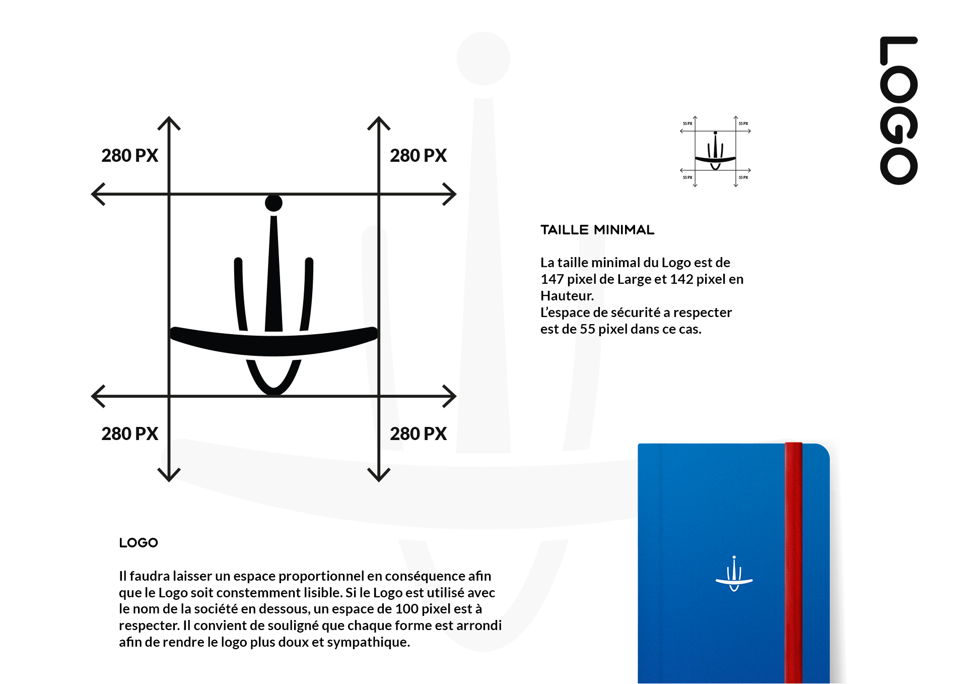
It will be necessary to leave a proportional space accordingly so that the Logo is consistently legible. If the logo is used with the company name below, a space of 100 pixels must be respected.
It should be noted that each shape is rounded in order to make the logo softer and more friendly.
It should be noted that each shape is rounded in order to make the logo softer and more friendly.
Sementics
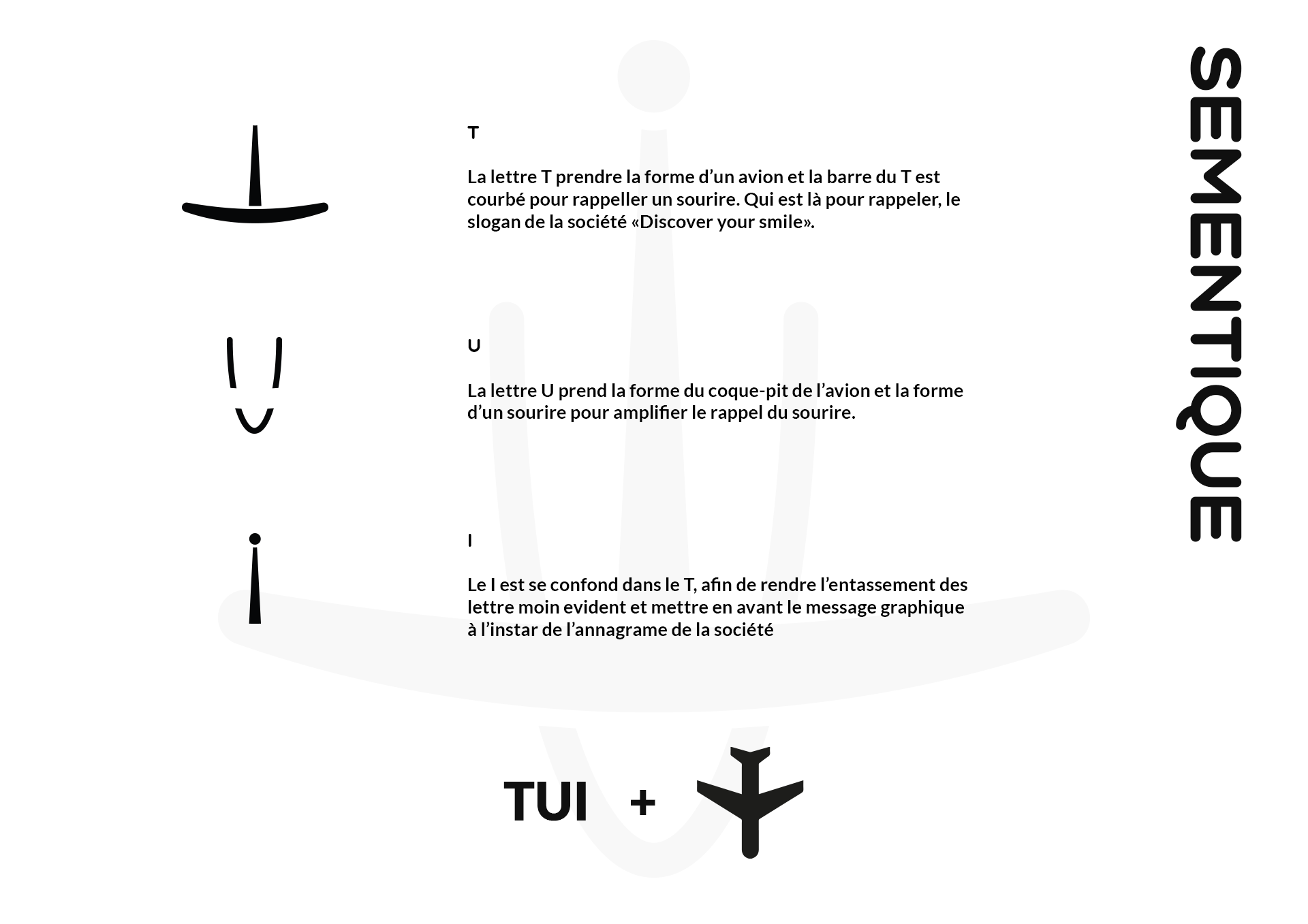
T
The letter T takes the shape of an airplane and the bar of the T is curved to remind a smile. Which is there to remind, the slogan of the company "Discover your smile".
U
The letter U takes the shape of the hull of the plane and the shape of a boat seen from above.
I
The I is merged into the T and emphasizes the graphic message. It also reminds the shape of a lighthouse which reinforces the idea of traveling at sea.
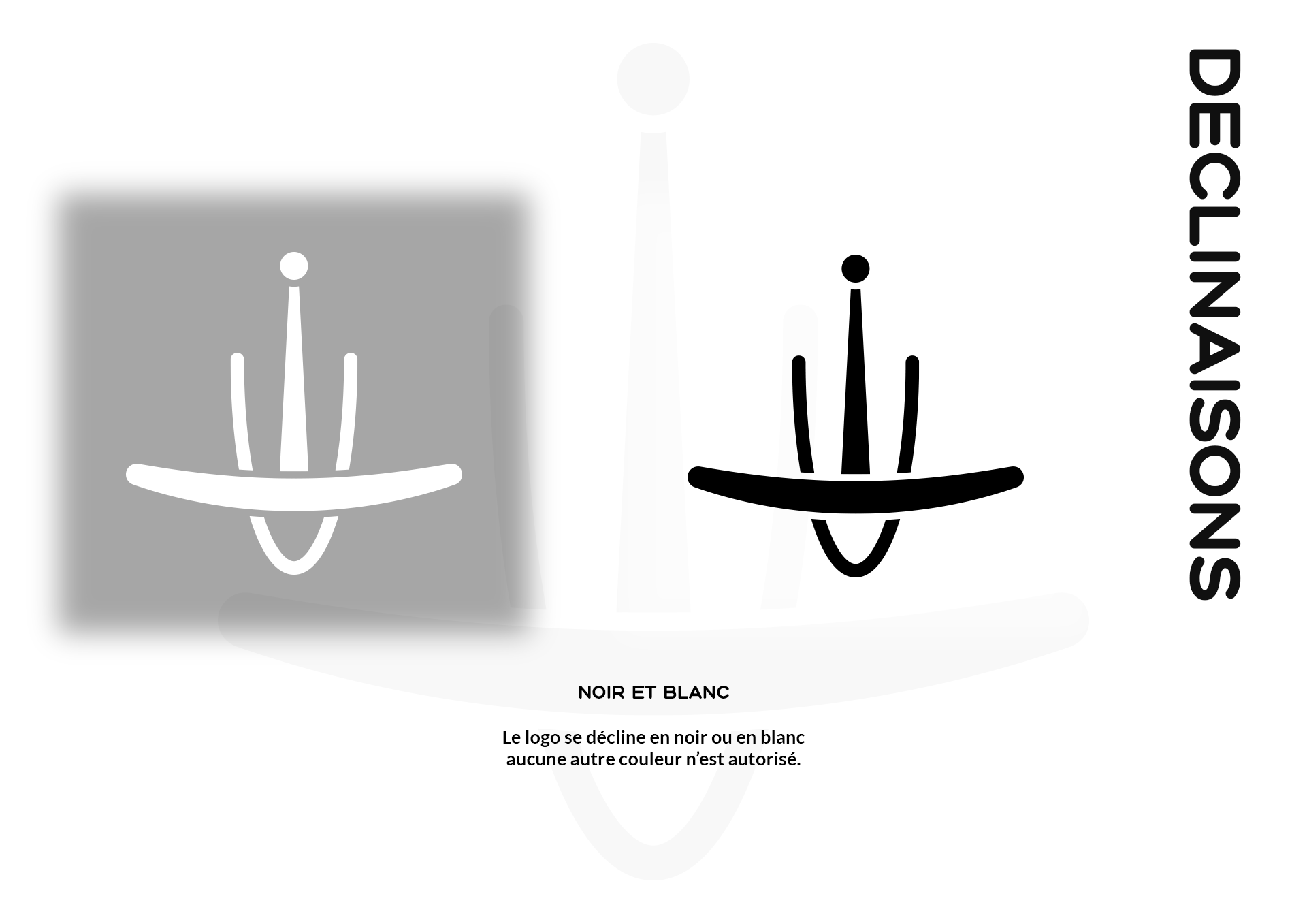
Black and White
The logo is available in black or white, no other colors are allowed except for blue and red.